
Easiest Landscape Painting You Must Try
You can either watch the video, or read the text below. Both options contain the same content.
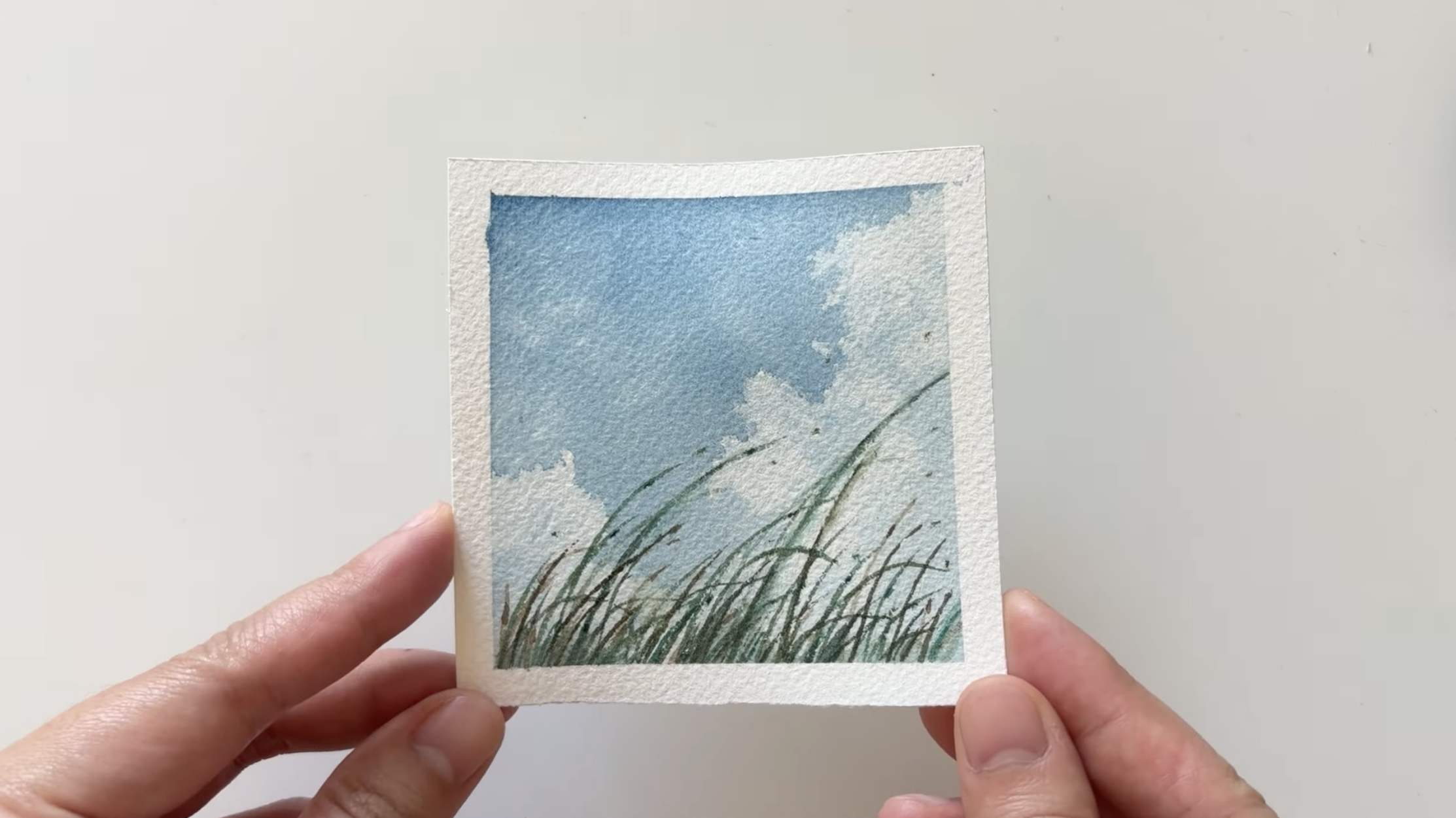
Just a brush, a tiny piece of paper, three colors, and a tissue. That’s all you need to paint this little landscape, in just a few minutes.
Painting watercolor can feel a bit intimidating at first. If you’re not sure how to start or how to keep going, you’re not alone. I felt exactly the same way when I first started. That's why I love this tiny landscape painting! It’s simple and super satisfying to do. Even now, I still come back to it when I want to paint something quick and calming.
Today, I’ll show you how I paint it in real-time, step by step. And you may be surprised by how doable it is.
Get you ready with simple materials
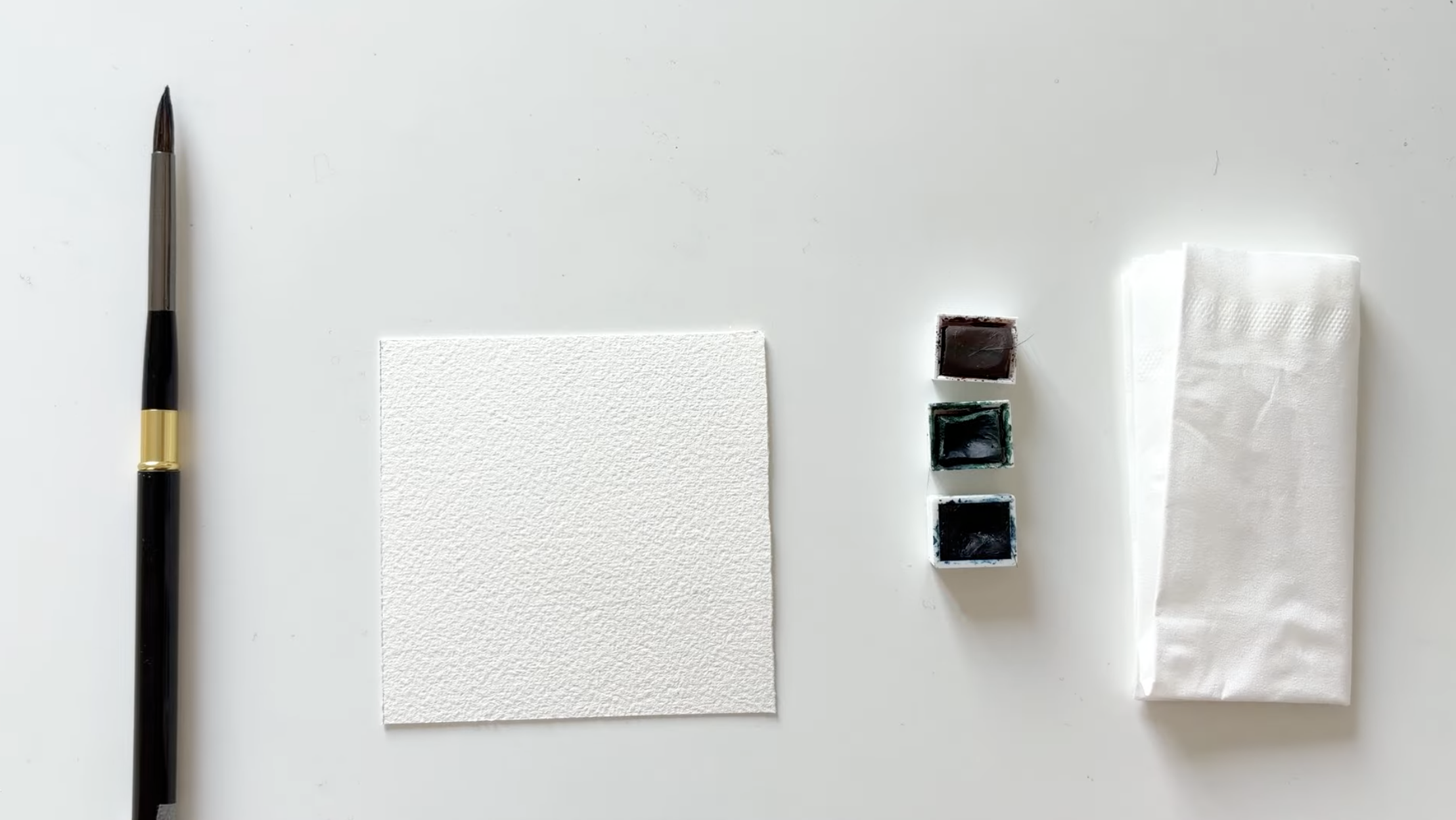
I’m using a tiny pointed mop brush to keep things simple. It’s super versatile. You can use it for big washes and for small details.
For the colors, we just need three simple shades: a blue tone, (here I’m using Prussian Blue,) a warm brown, (like Burnt Umber,) and a cold green (this one is Viridian). You don’t have to use the exact same color, just grab whatever you have that’s close enough. The idea is to keep it really minimal and relaxed.
I recommend using cotton, cold-pressed watercolor paper. You don’t need the fancy stuff to get started, but using good paper is really necessary. It just handles water better, and makes the whole process feel a little less messy.
As a beginner, you really don’t have to be an expert in tools or materials. Just grab what you have, and let’s paint.
Wet the paper with water
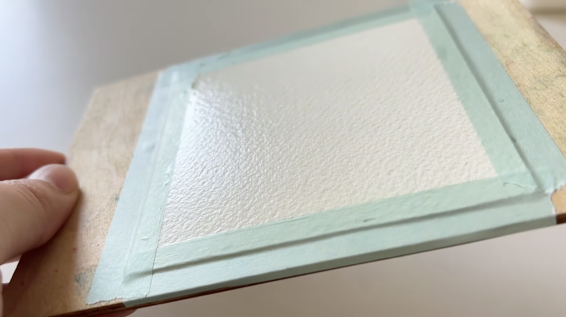
After taping down your paper onto a surface, we’ll wet the paper with clean water. Make sure the entire surface is evenly wet, not dripping, but with that nice shiny look. I know this isn’t the most visual part of the painting, but it’s actually super important.
Once the paper starts to look matte, I’ll go back in and re-wet it. That helps slow down the drying, and gives us more time to play with the paint.
Paint the soft blue sky
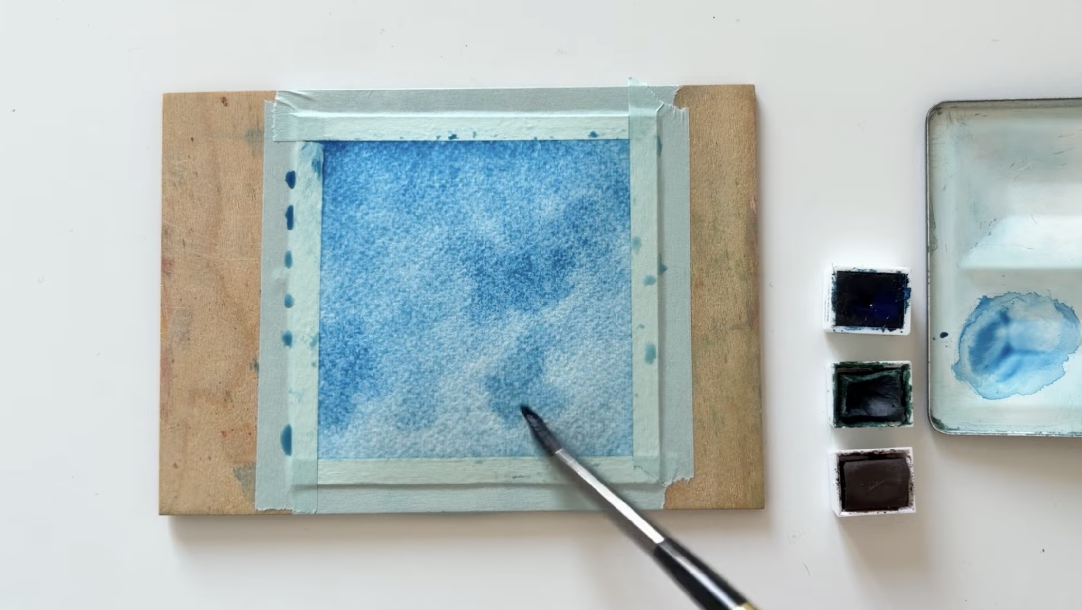
Now for the sky. I’m using Prussian Blue for this part, it’s one of my favorite colors.
Gently spread the blue across the wet paper. Don’t worry about being too perfect here, just let the paint move around naturally. Since we’re going to have some white clouds later, I’m keeping the blue nice and rich to create a stronger contrast.
You can dab in a little more intense blue in a few areas to add a bit more variations. This helps give the sky some depth and makes it a bit more dynamic.
Create the shapes of fluffy white clouds with tissues
Now we’re going to use a really simple technique to create those soft, fluffy white clouds. And it’s actually really fun once you try it.
Grab a tissue, crumple it a little, and pinch one corner to make a tiny tip. Then gently press that corner onto the paper wherever you want to lift out a cloud. You see the tissue just absorbs the paint and leaves behind soft white shapes. Kind of magical right?
This only works if the paper is still wet. That’s also why I like to wet the paper twice at the beginning, to keep it damp longer.
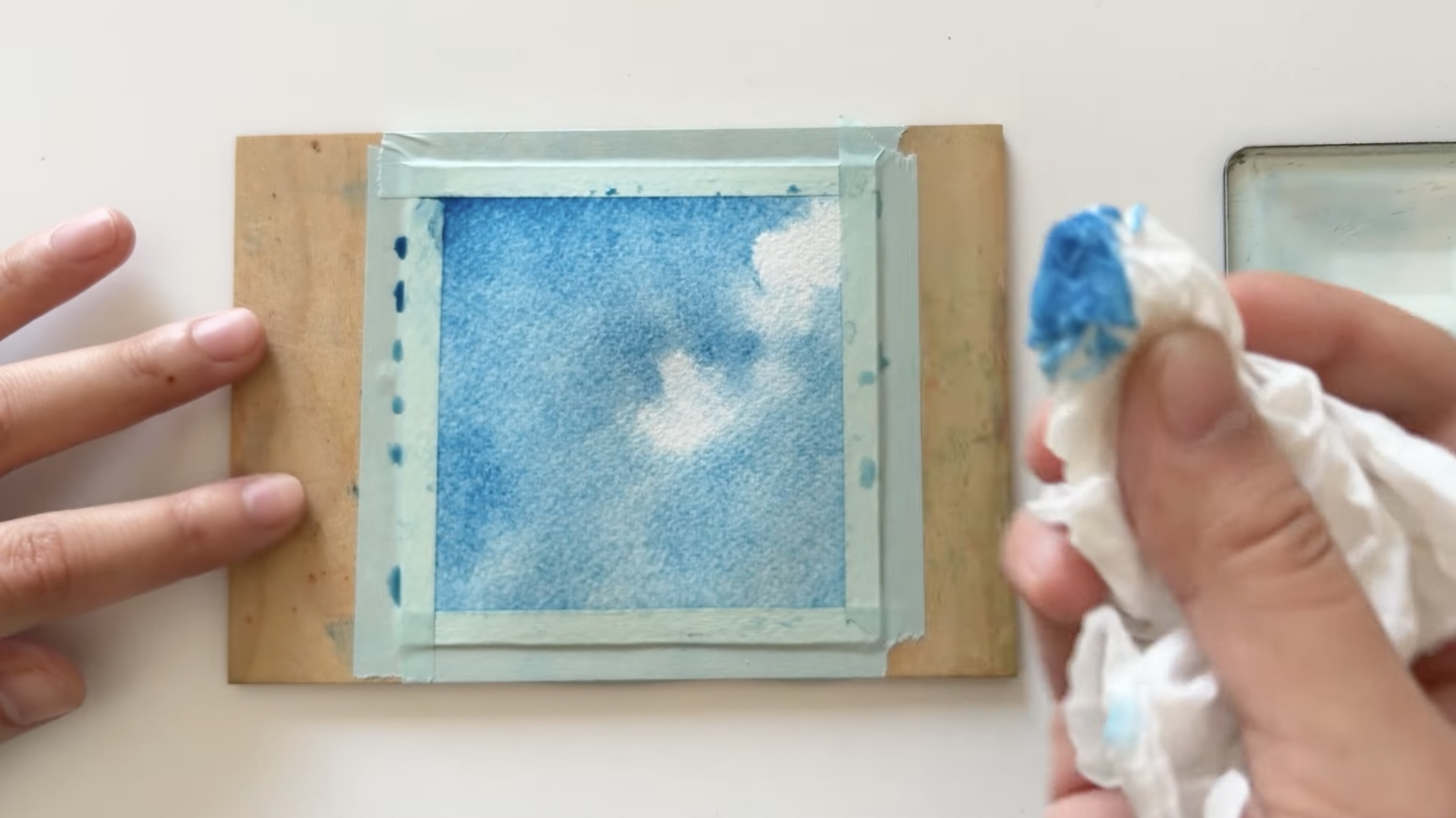
Adjust the cloud shape little by little (but quickly)
Press a bit harder, for the top of the clouds, to lift more color and make it brighter. And for the bottom, press more lightly to keep a hint of blue. This creates a soft, airy shadow. And don’t forget to switch to a clean part of the tissue while lifting.
If you feel the contrast isn’t strong enough, you can also go back in with a fairly dry brush and dab a bit more blue around the edges.
You can also pinch a small tissue tip to gently adjust the edges and shape of your clouds, so they become soft and natural.
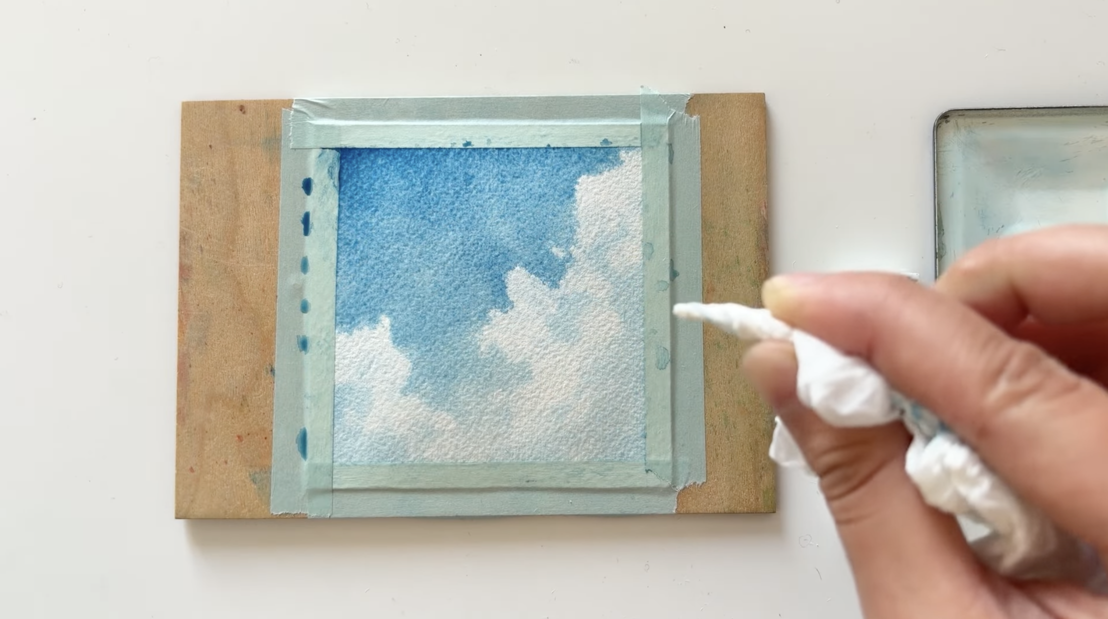
If your clouds don’t look super natural right away, that’s totally normal. It takes some practice to get the feel for lifting and shaping them.
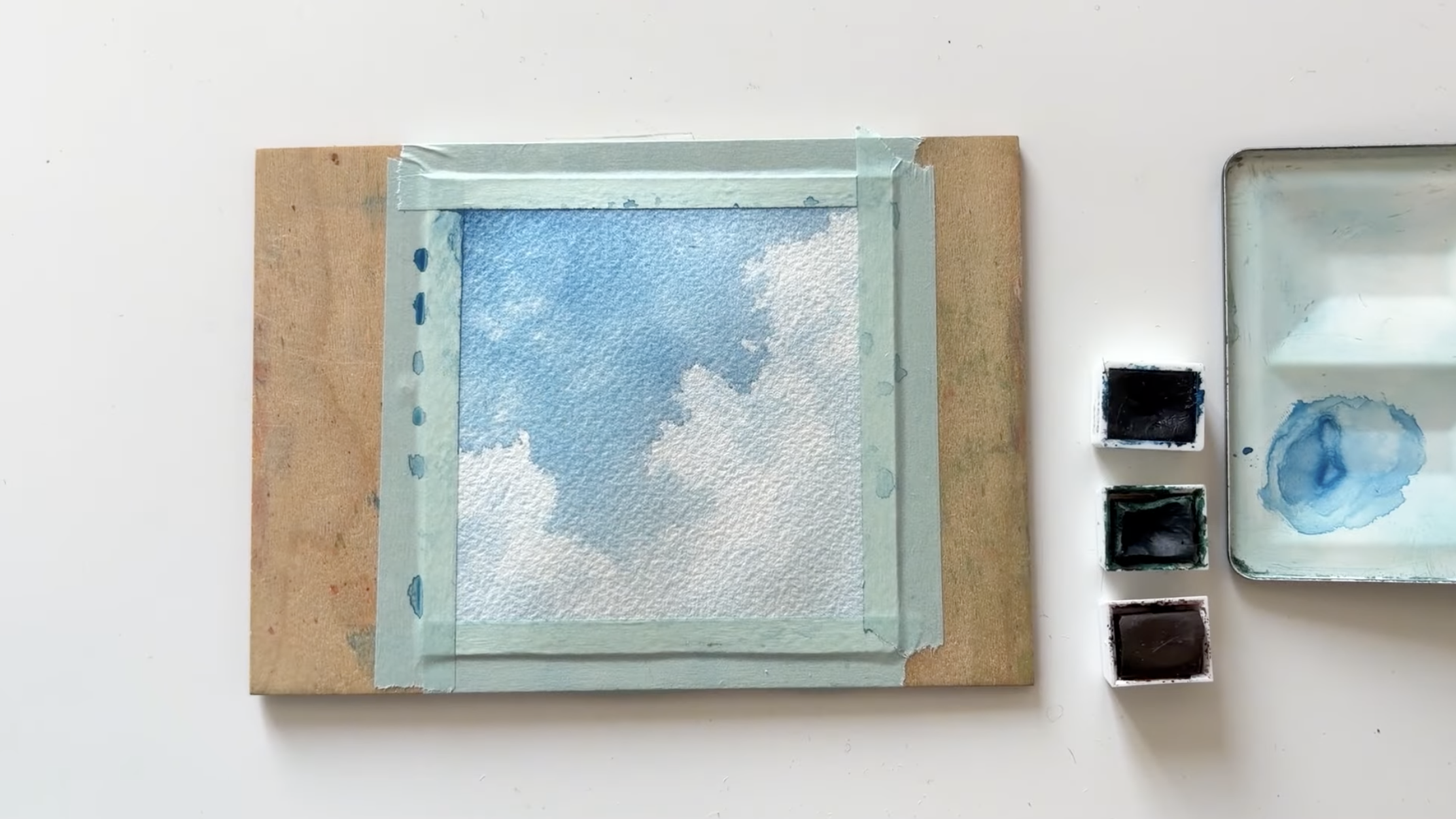
Add some wild grass in the foreground
Once the paper is totally dry, we can move on to the foreground. I’m mixing a bit of green with some burnt umber to tone the color down.
Then use the tip of my brush to add a few quick, curved strokes, just to suggest the shape of some tall grass. I’m letting them tilt a little toward the right, like there’s a breeze coming from the left. It gives the whole thing a bit more life.
Some strokes overlap or cross each other and that’s totally fine. We don’t need to be precise here. It’s really more about creating a natural, slightly wild look.
I really like this part: it’s loose and kind of meditative. We are just making simple strokes, and it almost feels like the grass is dancing a little.
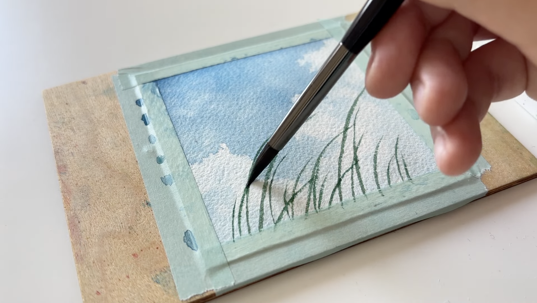
Some final touches
I also mix in a touch of blue to vary the greens and make them feel more vibrant. And for the darker blades of grass, I just use less water in the mix.
And finally one of my favorite little details: I like to add a few tiny dots. Either along the grass or floating up a bit, like they’re drifting in the wind. It’s just a small touch, but it makes everything feel a bit more alive.
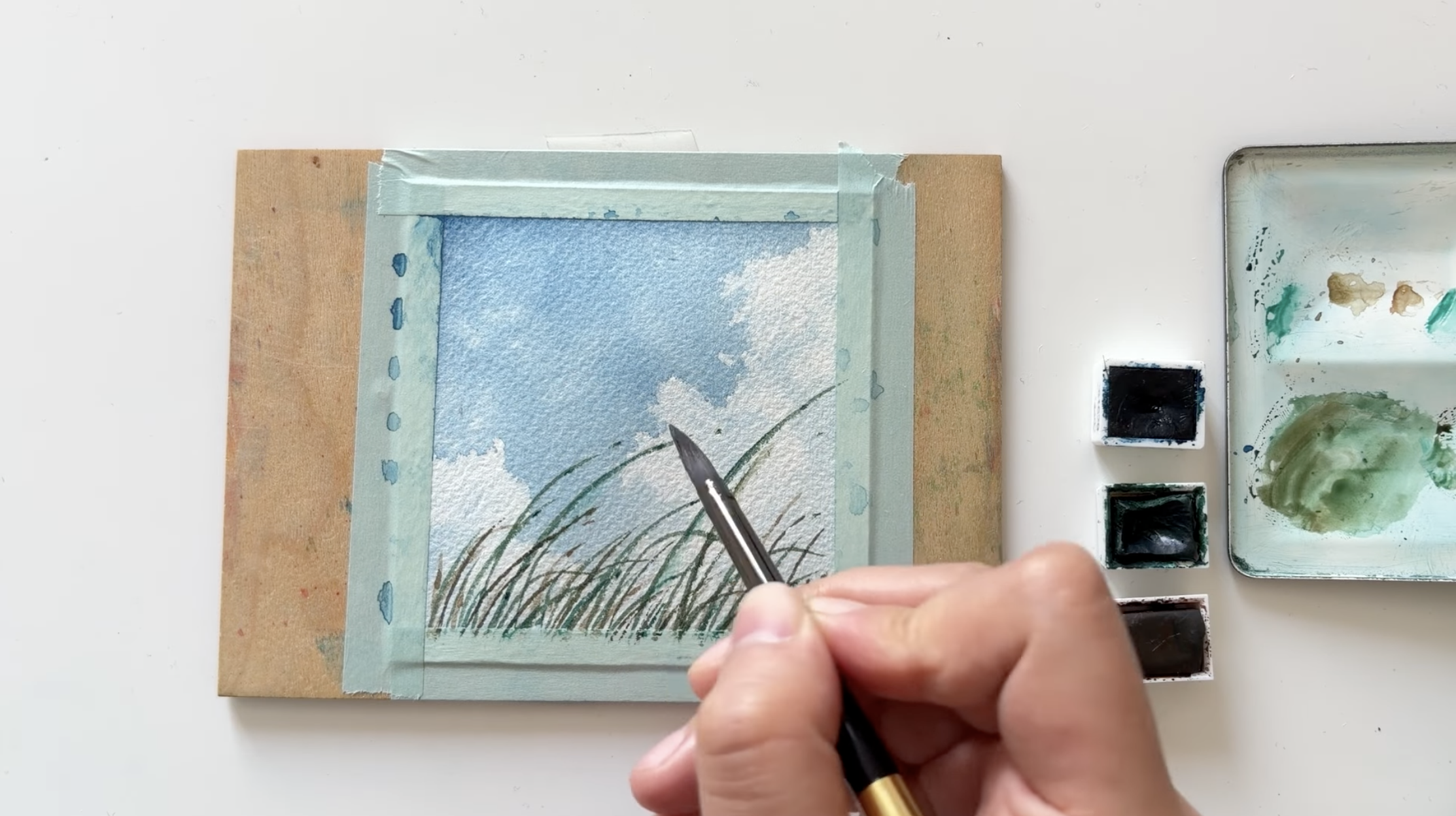
And that’s it! Just a brush, three colors, and a tiny piece of paper. And we’ve ended up with this little landscape painting.
Want to learn watercolor?
I made an online course that’s designed to help you build confidence, stay motivated, and have fun exploring watercolor essentials at your own pace.